Pipeline Signal Studio
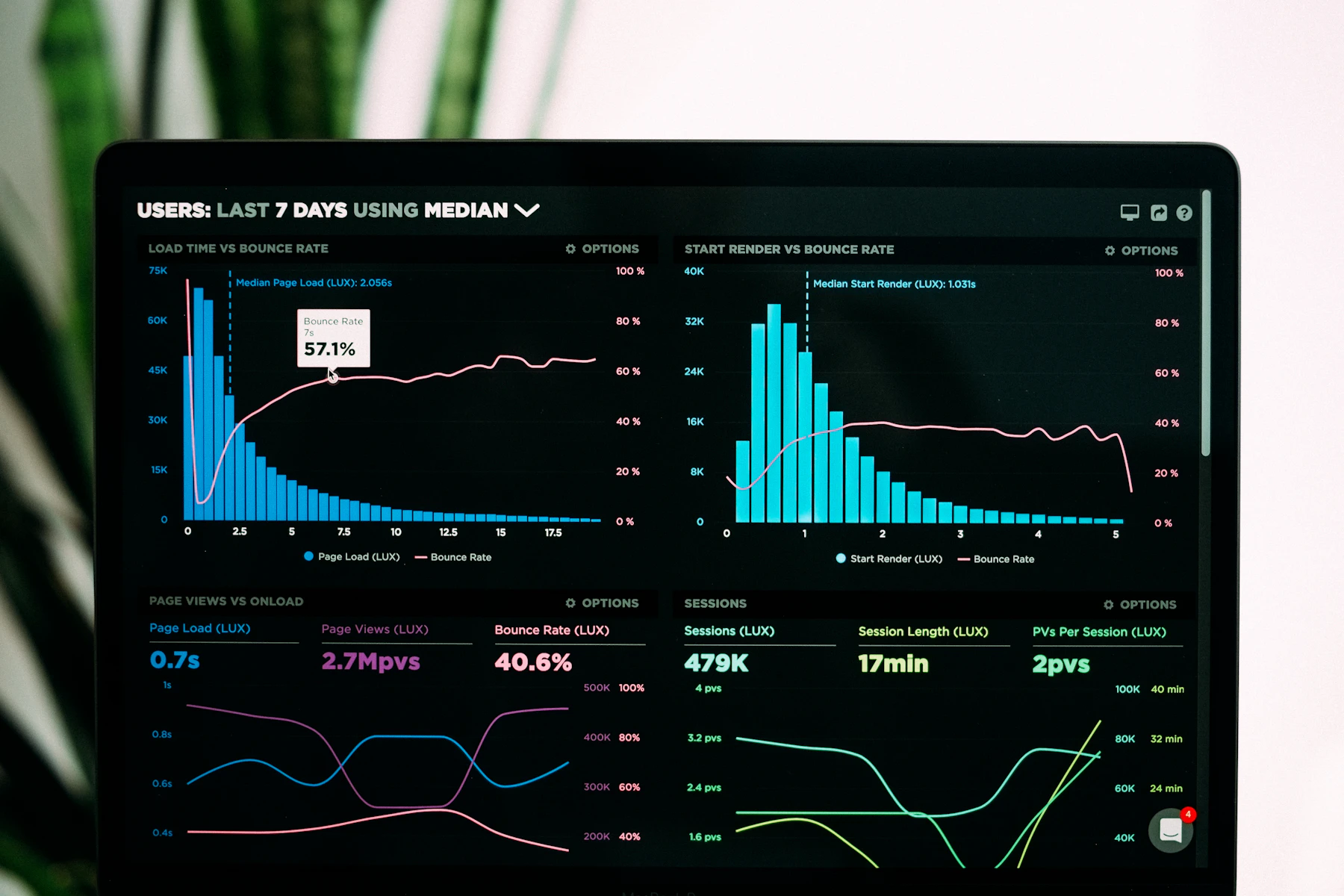
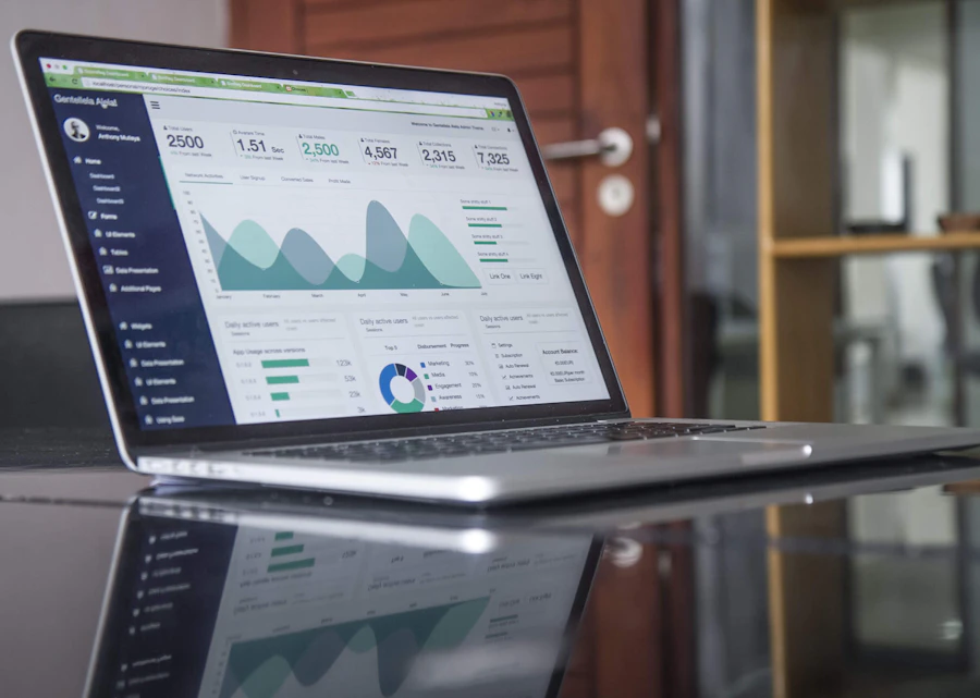
Build a monitoring board that tracks freshness, schema drift, and null spikes across connected sources.
View curriculumTrain your team to spot integration drift early — with dashboards that explain quality, not just volume.
Browse programsFeatured programs
Short, applied tracks for people who already move data — and need the board that proves it arrived intact.
Build a monitoring board that tracks freshness, schema drift, and null spikes across connected sources.
View curriculum
Turn incomplete fields into a story stakeholders can act on before the weekly ops review.
See all programs
Practice alerting rules that catch silent column changes without drowning the on-call channel.
See all programs
Why teams join
From the cohort floor
“The freshness tile from Pipeline Signal Studio finally stopped our Monday debate about whether overnight loads finished.”Amira K., data ops lead · Petaling Jaya
Optional brand clinic for teams who want a guided pass over their Data Visualization and Analytics Platform for Data Integration Quality Monitoring.